
Overview
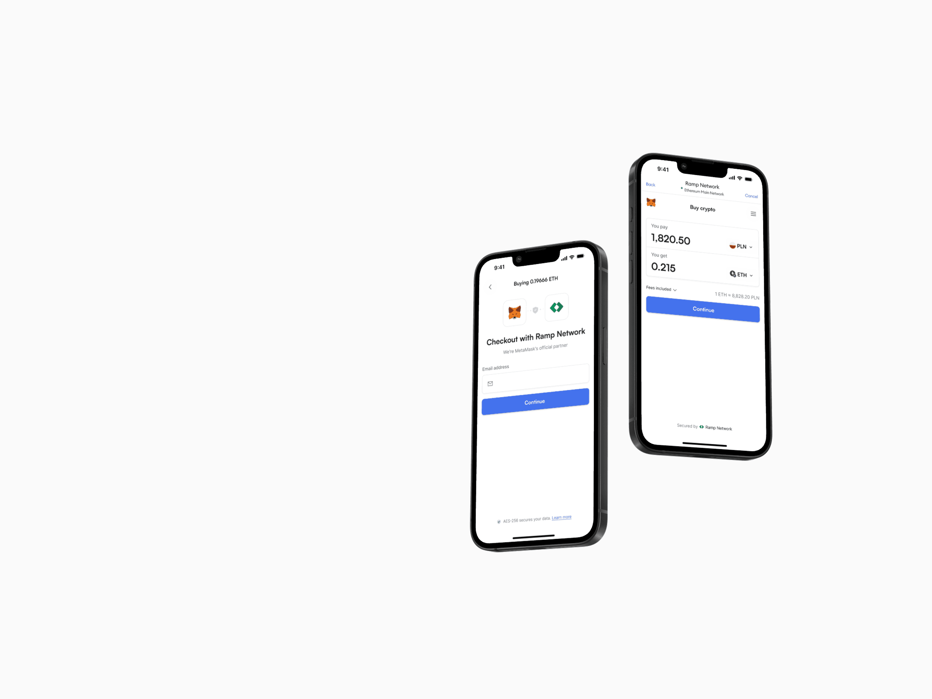
Ramp.Network is a fintech company that provides a crypto on-ramp and off-ramp solution, allowing users to easily buy and sell cryptocurrencies using traditional currencies. Its main product, the Ramp widget, integrates with both custodial and non-custodial wallets, helping businesses offer seamless crypto transactions within their apps or platforms.
My contribution
I'm part of a team that works on the process where users can buy and sell crypto. I design and test ideas to improve conversion and user experience. I do A/B tests, run usability tests, and analyze data to understand how people use the product. I also create interactive prototypes in Cursor AI to test ideas quickly. Together with five other designers, I help build and improve our Design System, and we work together to keep consistency across the product.
The team
I work within two teams at Ramp.Network. In my product team, I collaborate closely with a Product Manager, four developers, and a data analyst to improve the transactional experience for buying and selling crypto. I'm also part of the design team, which includes five designers. Each of us works in a different product team, but together we make sure our designs stay consistent across the product. We develop and maintain our Design System and support each other in research.
Year
2023-2025
Process
Exchange Page redesign
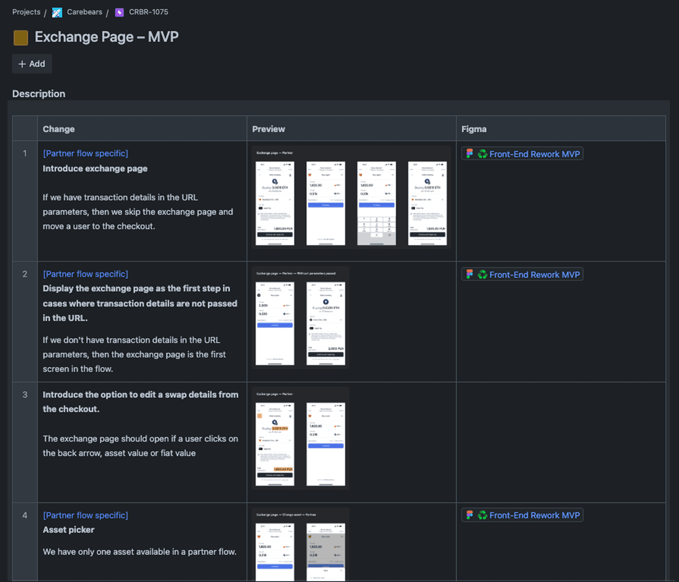
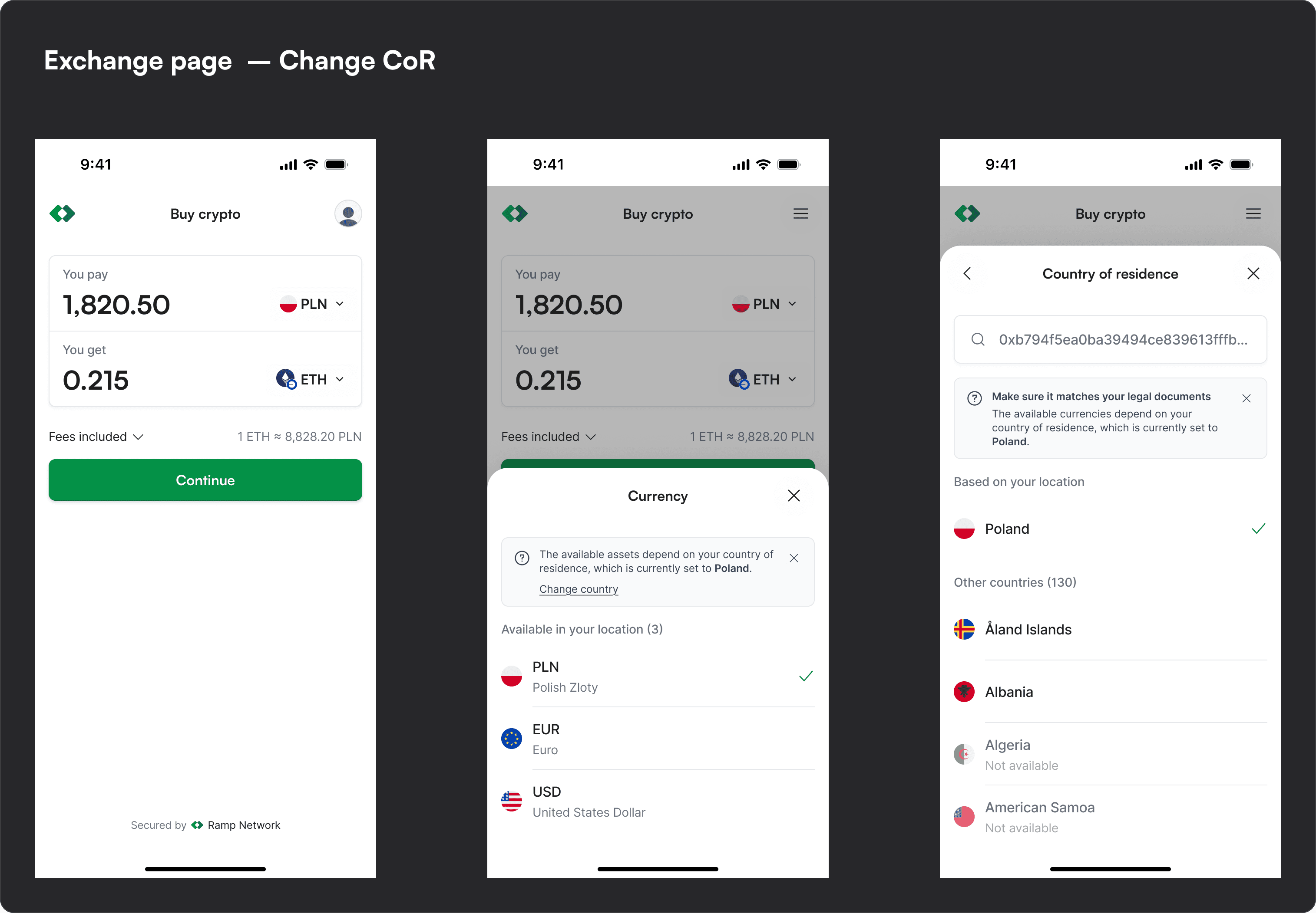
About the Exchange page
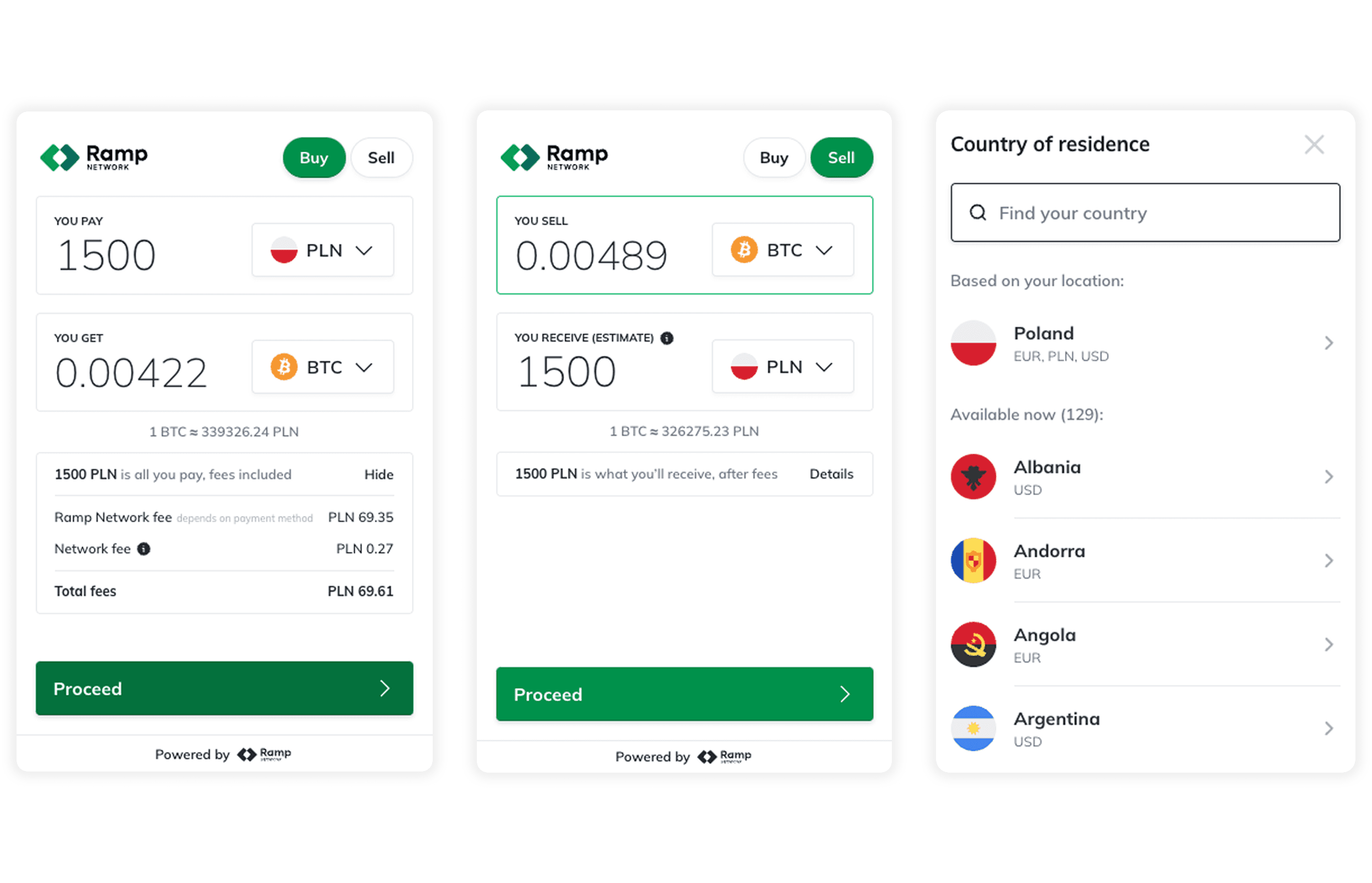
The exchange page is the first step in the process of buying or selling crypto on our platform. At this step, users enter the details of a transaction they want to make by selecting a token and the currency they want to use. This step also allows them to see the transaction fees.
Analysis of the existing solution
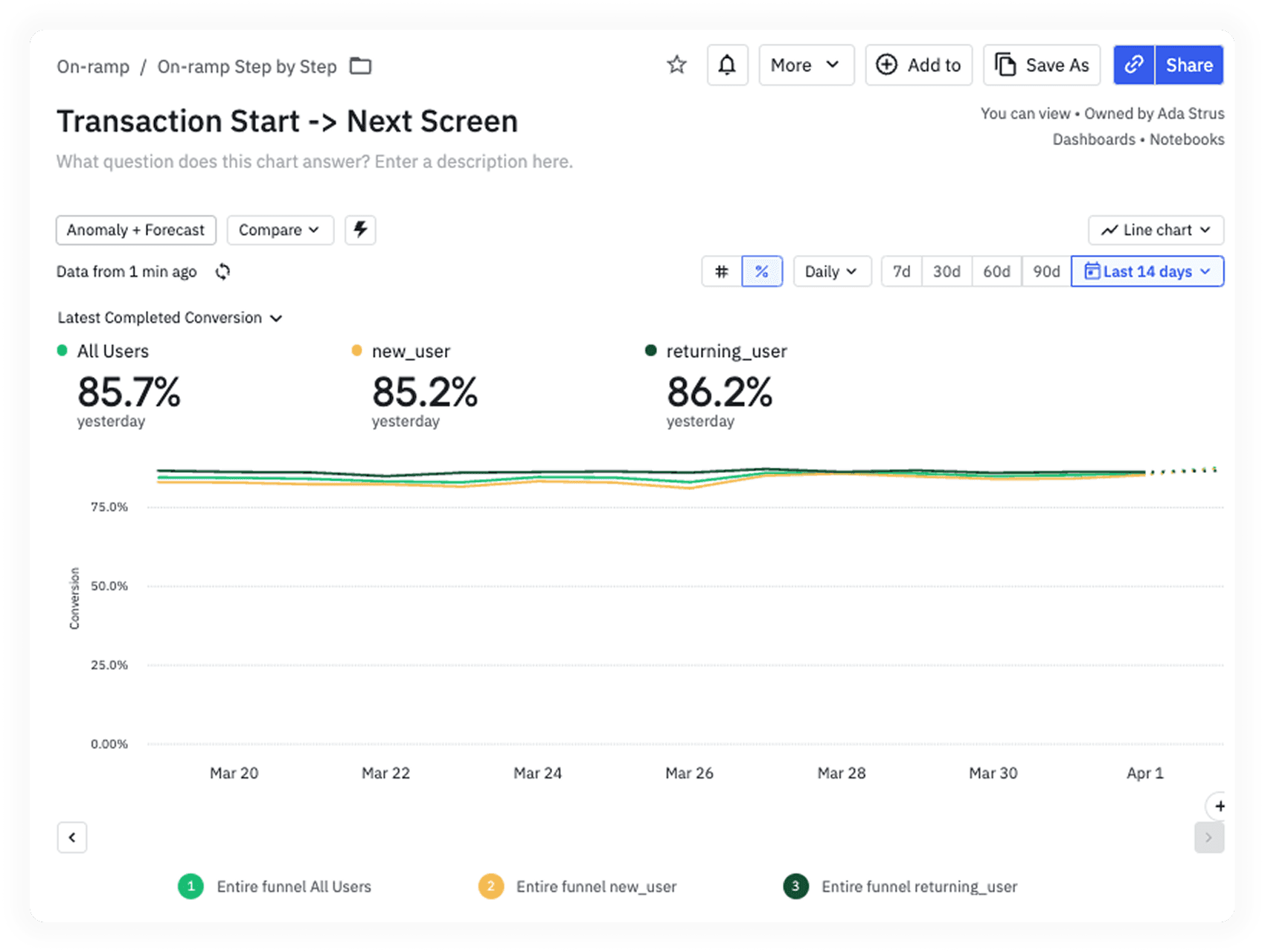
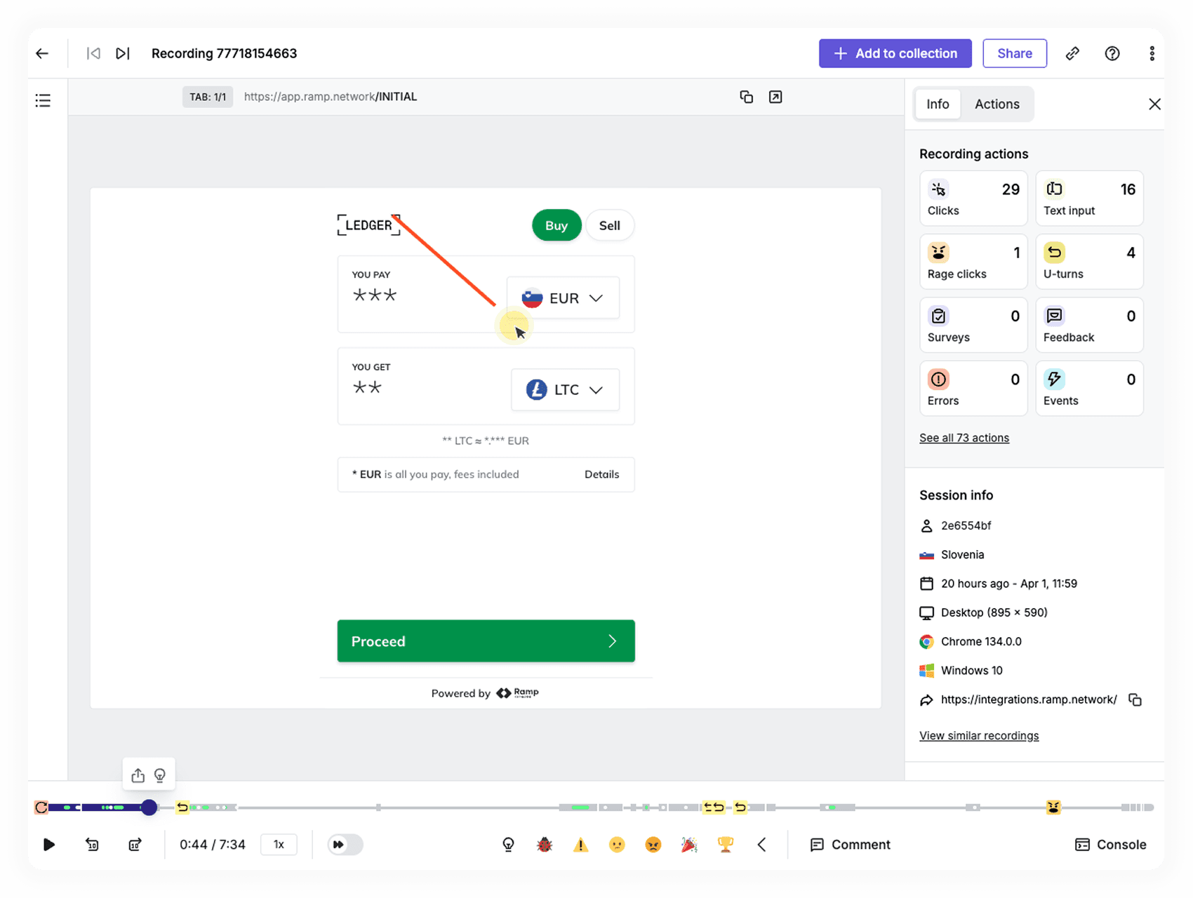
We were redesigning the entire user flow, and my task was to create the new exchange page. I started by analyzing the current version to find pain points by looking at quantitative data (Amplitude reports) and qualitative data (HotJar recordings). I also conducted a competitor analysis.
Ideation
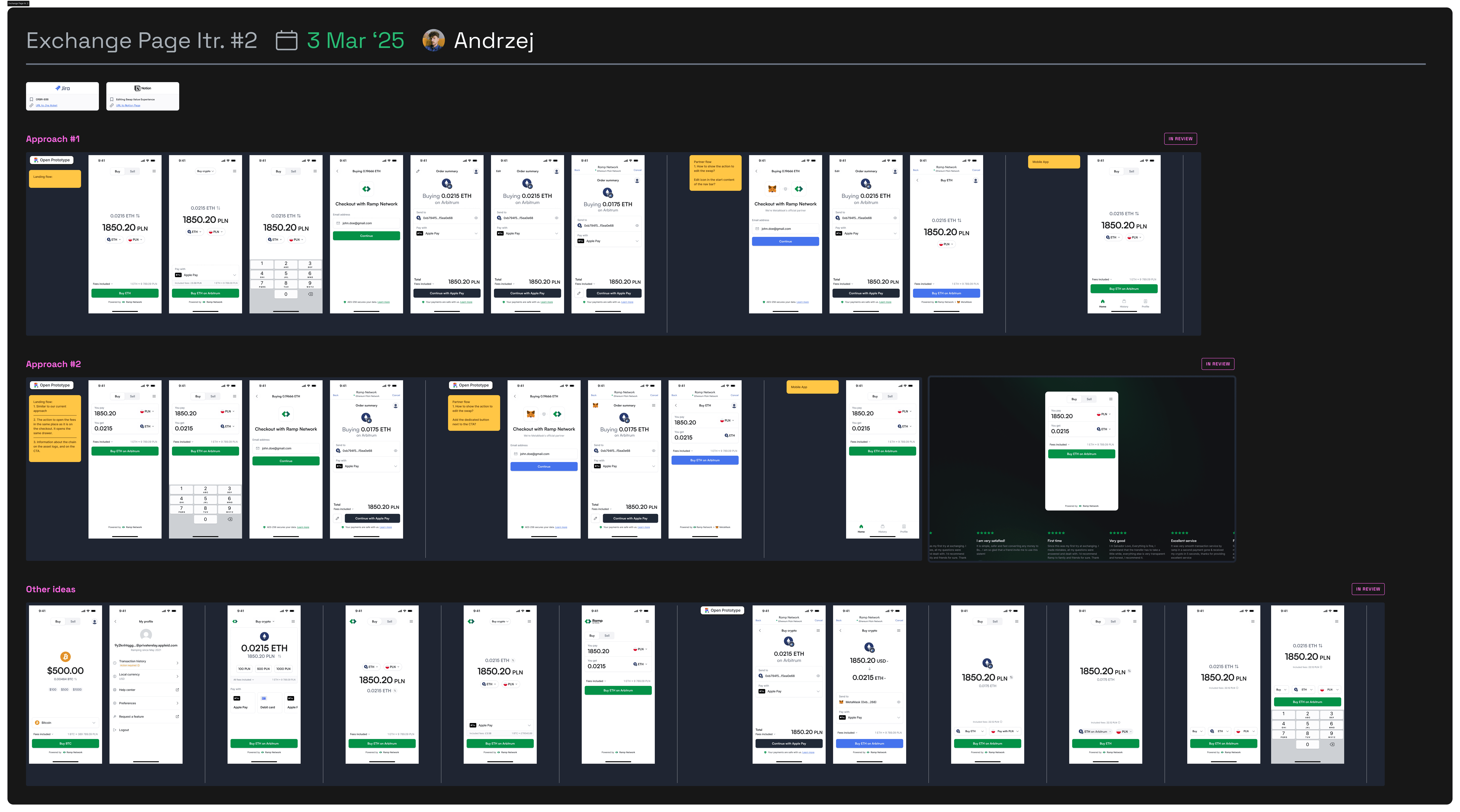
After gathering enough knowledge, I began the ideation phase. During this stage, I worked closely with a PM and other designers. The goal was to explore multiple directions, analyse them, and choose one or two of the best to move forward with.
Usability tests
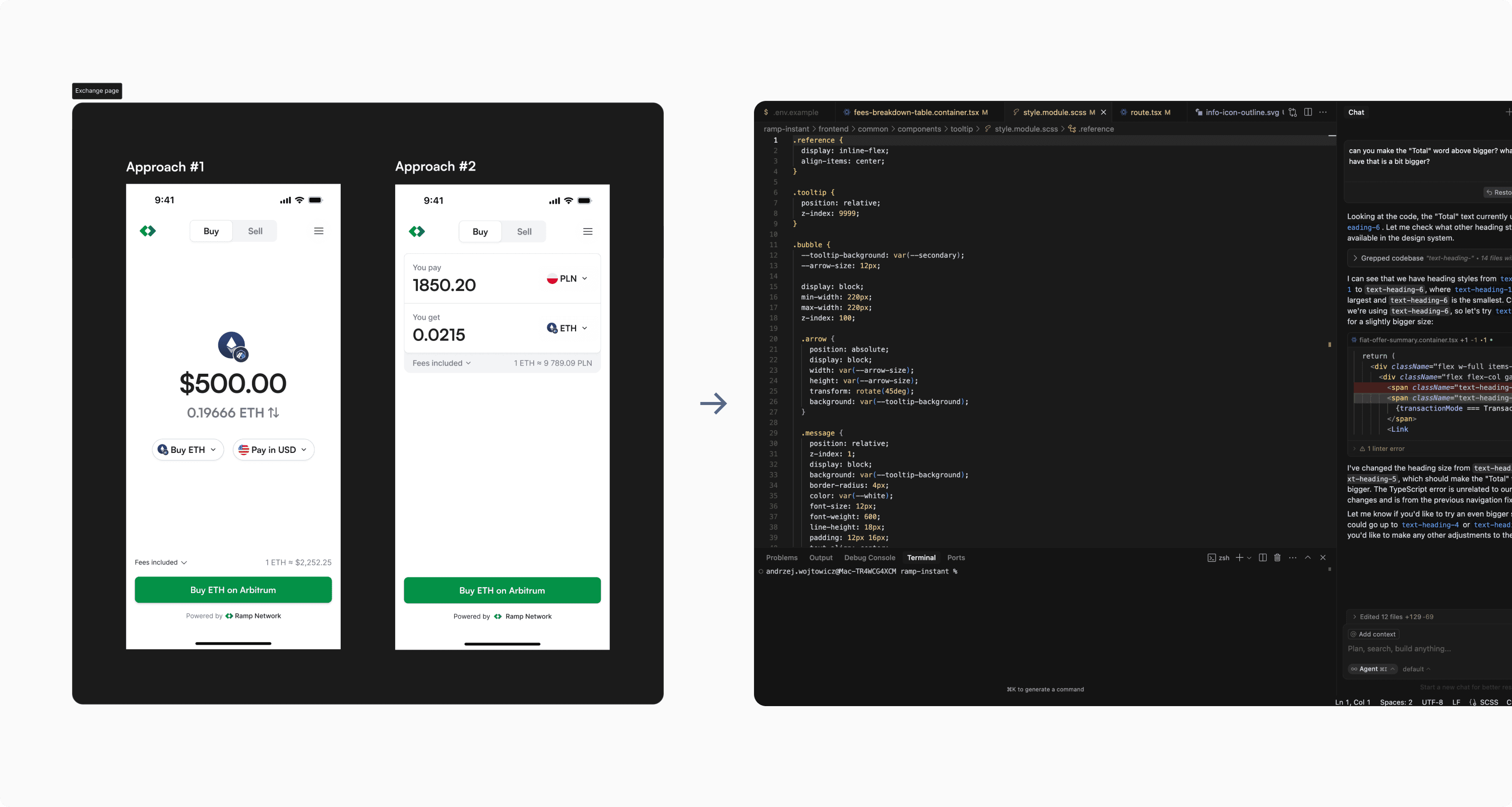
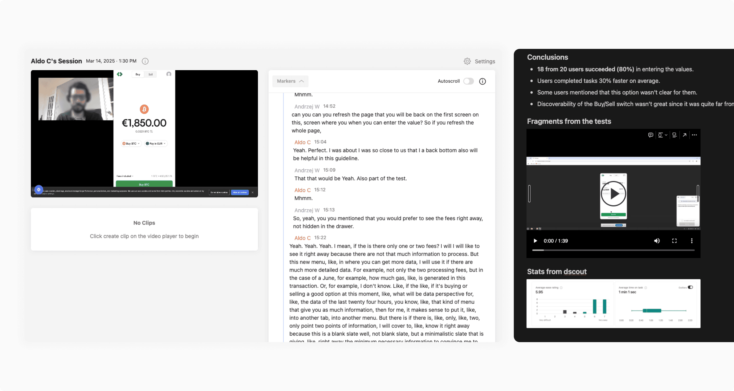
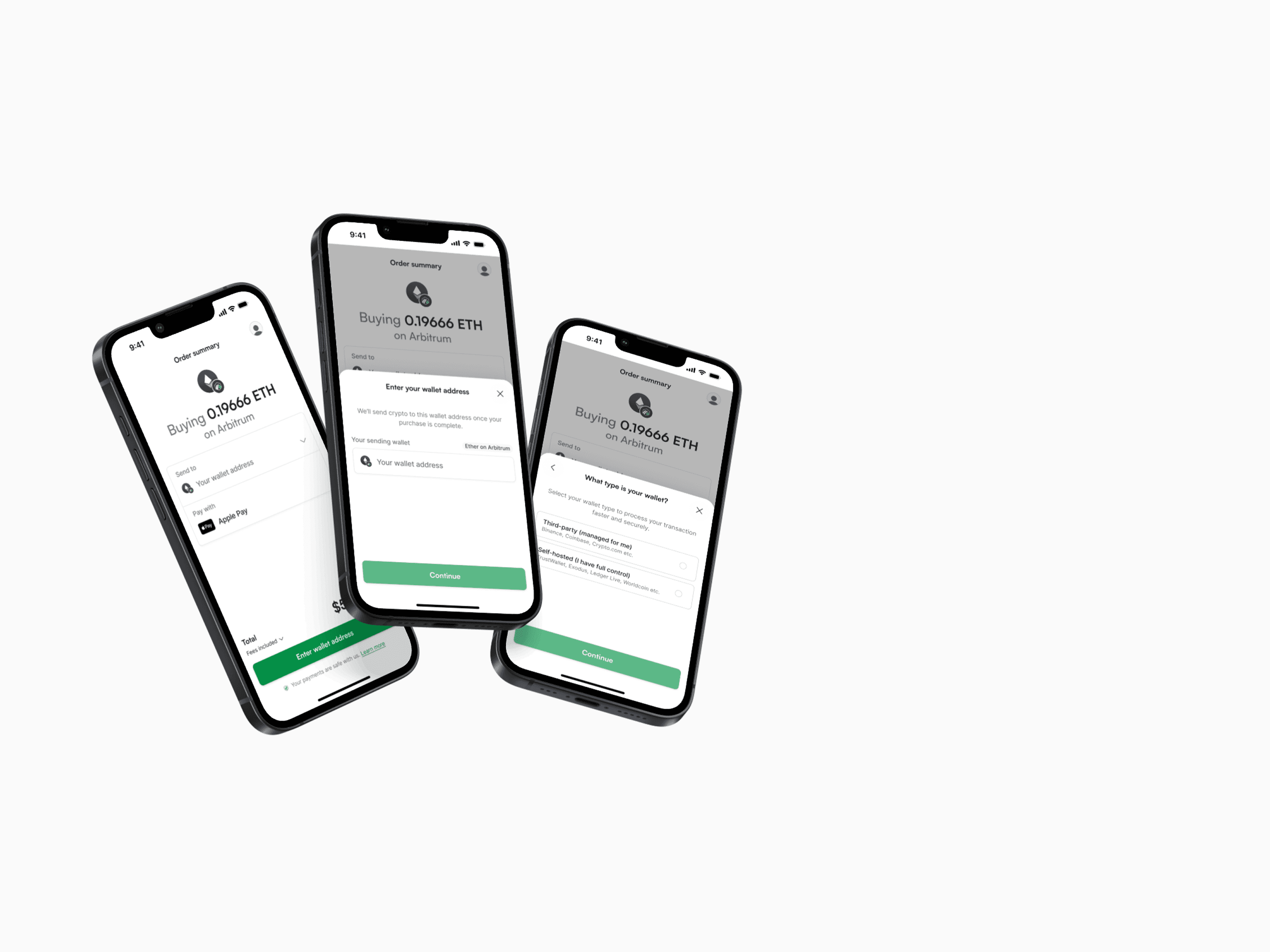
After the ideation stage, we had two different high-fidelity designs of two variants. Each had its pros and cons, so we decided to conduct usability tests to see which one worked better for users. For these tests, I created interactive prototypes using CursorsAI that felt almost exactly like the real product. I conducted 8 moderated interviews and 40 unmoderated usability tests with users recruited via dscout. Link to the solution #1, Link to the solution #2
Documenting the Usability tests
After the usability tests, I analysed the results and created a report documenting the findings. The document clearly showed that 20% of users struggled to switch between inputs in variant #1 and needed more time to understand how the screen worked. Based on the results, we decided to proceed with variant #2.
Finalising the Design
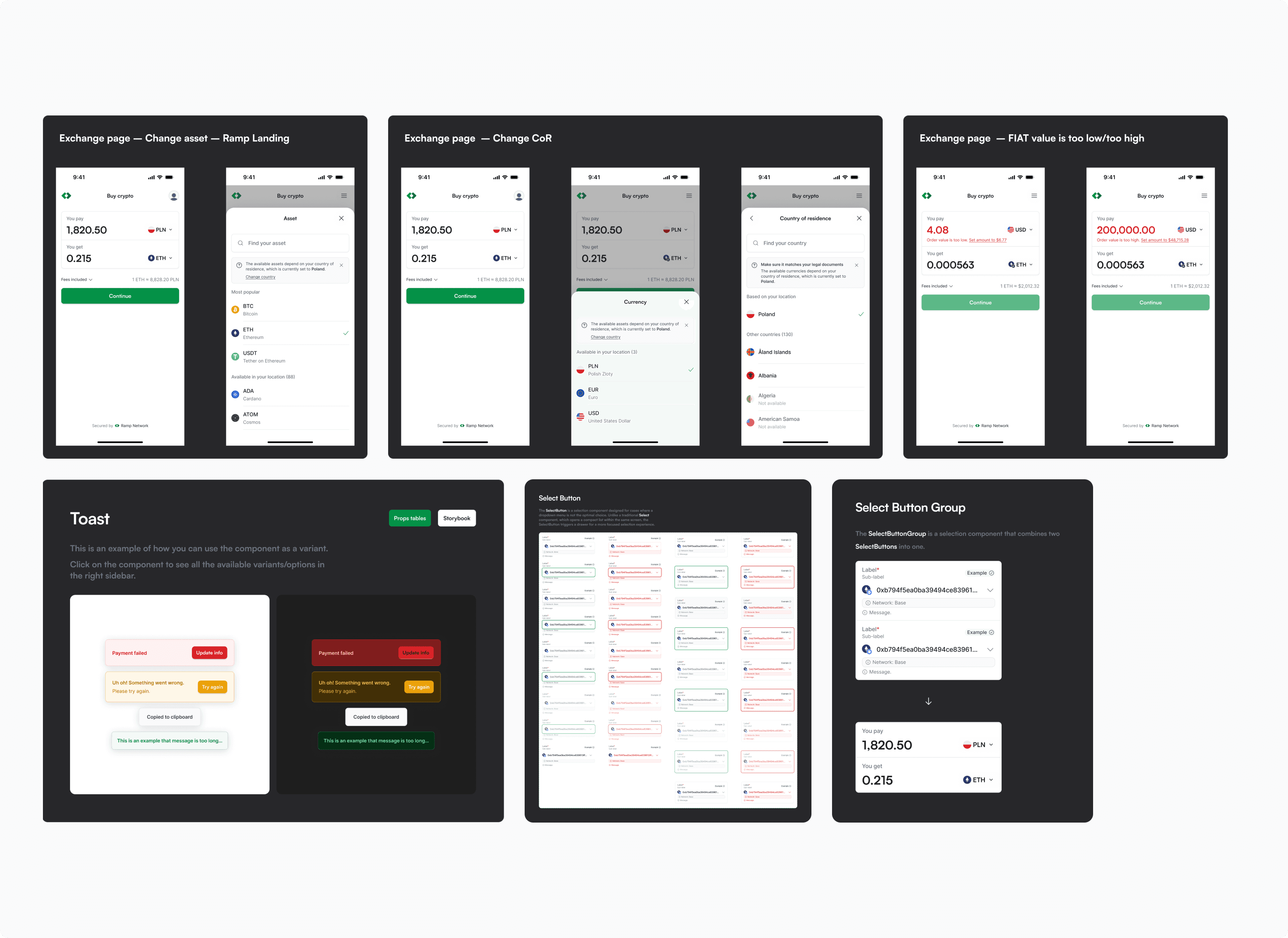
Since we had chosen a variant, I began preparing a more detailed design that covered all possible cases and supported refinements with the product team. At this stage, we also needed to ensure we had all the necessary components in our design system. If not, we added the missing components to both the library and the scope of the initiative. To maintain consistency across the product, we held design critique sessions with other designers to discuss details.
Handoff and Scoping
Once the initiative was refined, I added the design to the main Figma file, which serves as the single source of truth for all designs. I also collaborated with the product team to create a Jira Epic, where we defined the scope and acceptance criteria. Based on this and the Figma designs, developers broke the Epic into smaller development tasks.
Implementation Support, Testing, and Monitoring
During implementation, I supported developers by clarifying edge cases and ensuring the solution matched the Figma designs. Before release, we tested the feature internally through dogfooding to catch any issues early. After that, we rolled it out to users – sometimes gradually via A/B testing or a soft rollout. Once live, we monitored the released version by analyzing data in Amplitude and reviewing session recordings in HotJar to ensure everything performed as expected.
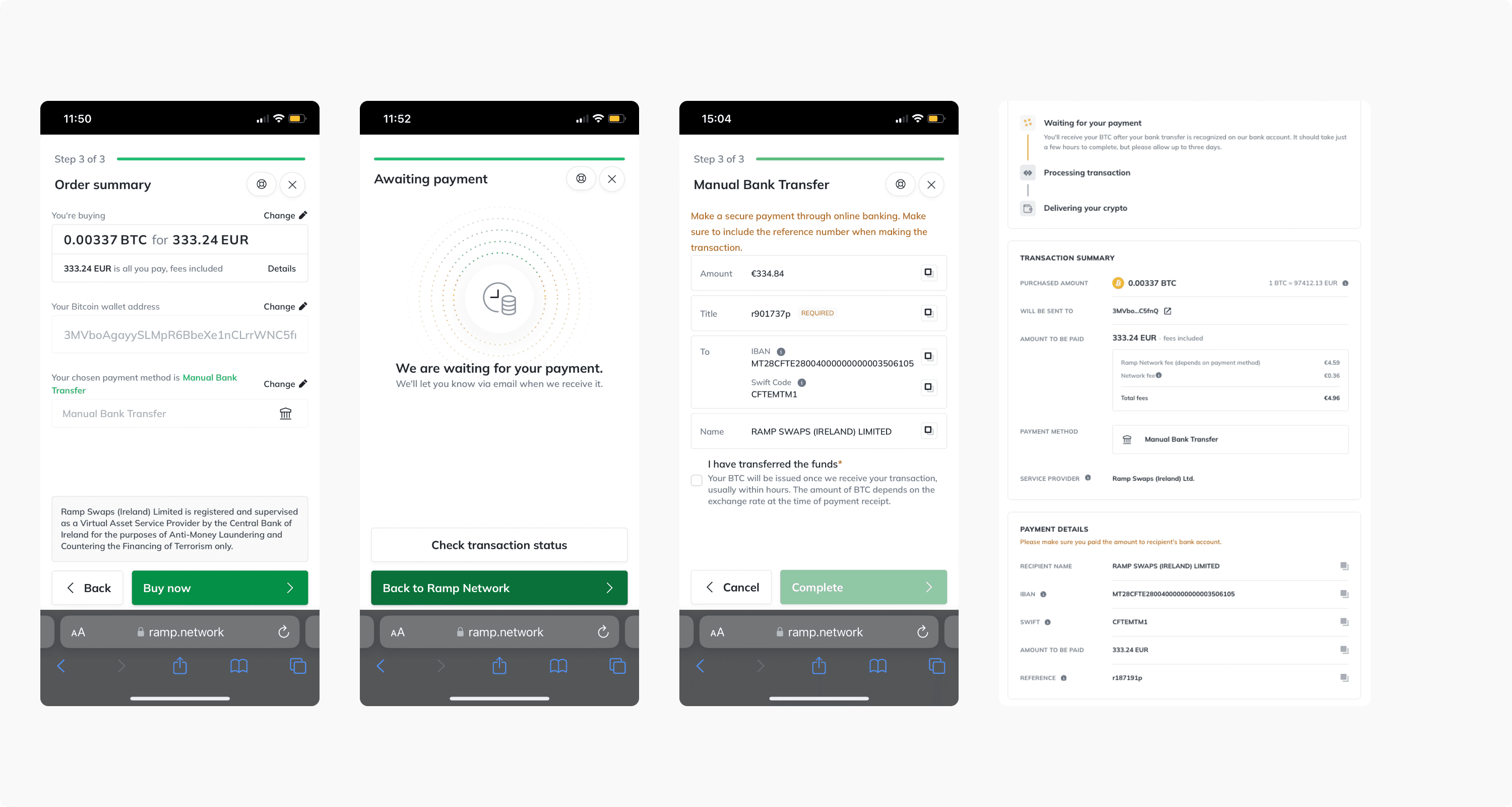
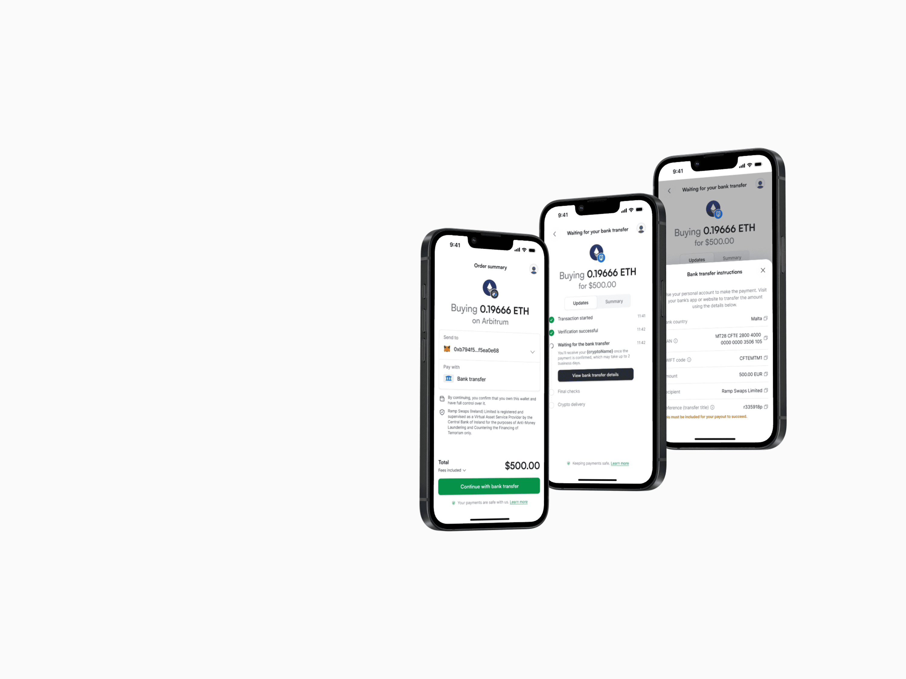
Bank transfer payment method
About the project
Manual bank transfer is one of the payment methods available in our On Ramp flow. Although it’s the cheapest option, only about 7% of users choose it, and it has the lowest end-to-end conversion rate at around 6%. By redesigning the entire On Ramp flow, we aimed to address these issues and improve conversions.
Identifying the problems
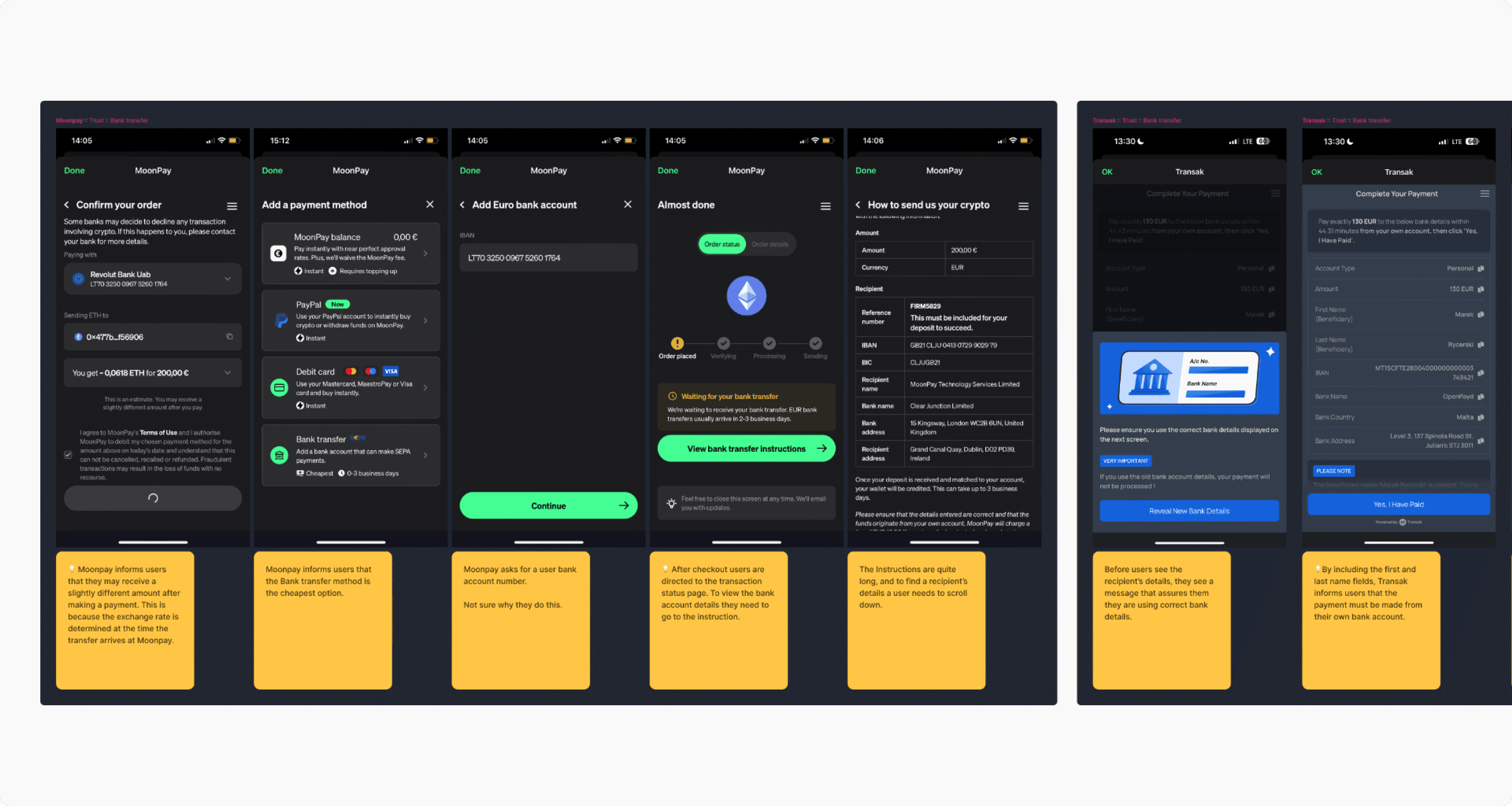
By looking at quantitative data (from Amplitude and Omni) and talking to our Customer Support team, we learned that many users completed the process but didn’t send the money. This was often because they didn’t understand the instructions—some made the transfer without including the reference number, while others didn’t send the funds at all.
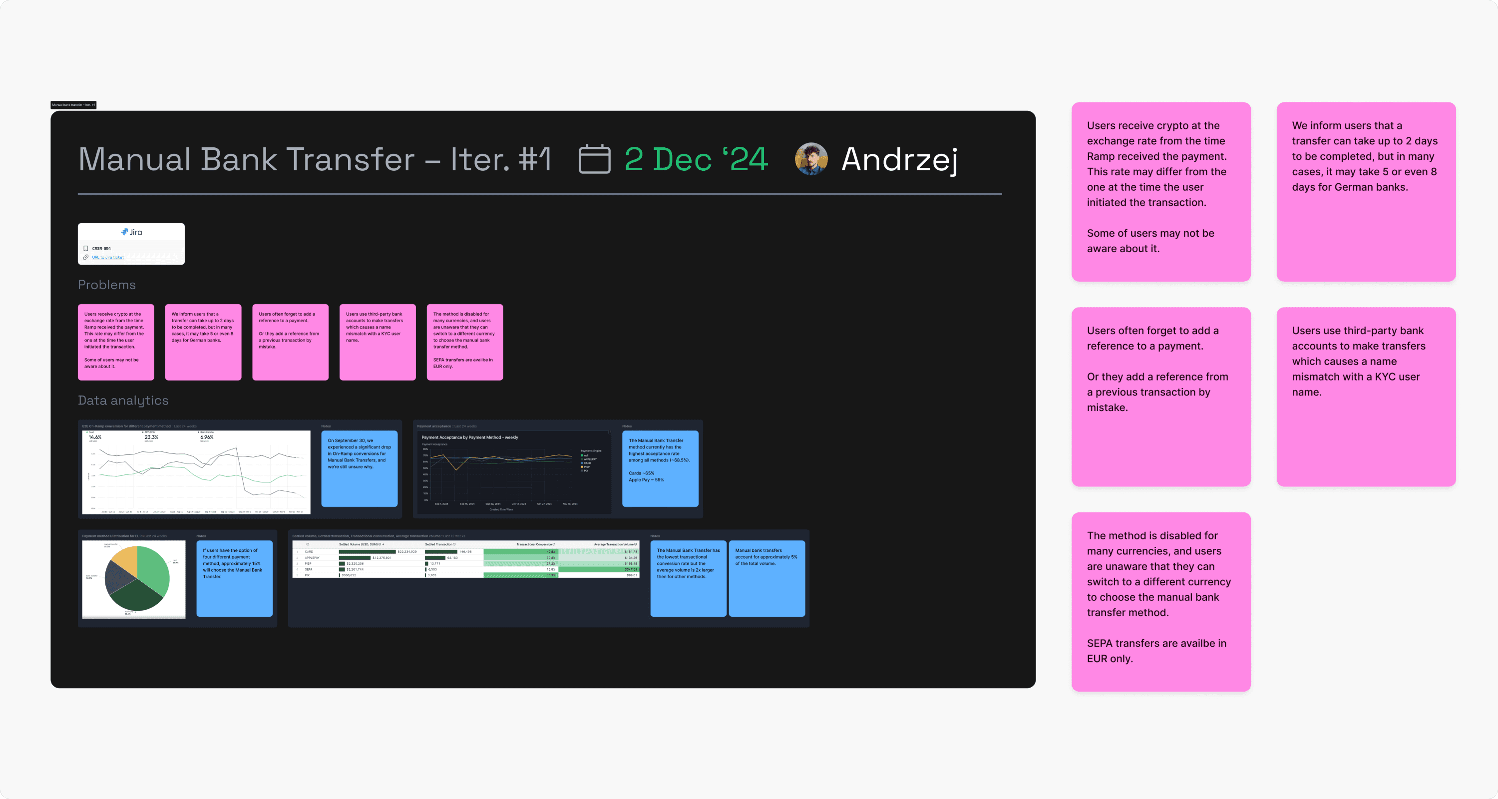
Competitors analysis
Next, we analyzed how other companies handle bank transfer forms. It was important to understand existing patterns and naming conventions. We noticed that many companies use infoboxes or labels to clearly highlight the importance of including the reference number, so we decided to apply a similar approach in our solution.
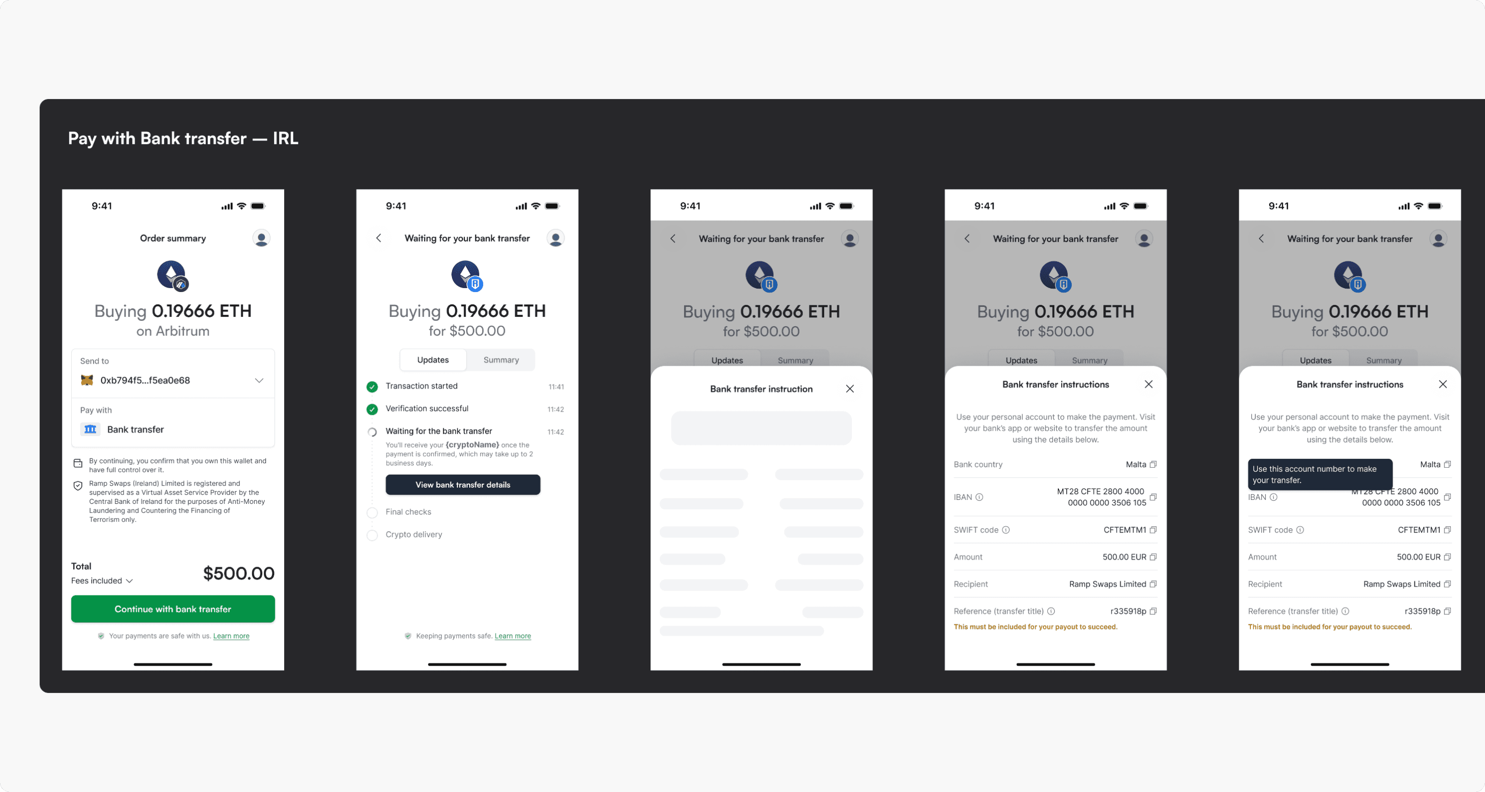
Design
We started with a few different approaches and discussed them during our Design Critique meetings. After a few iterations, we agreed on one direction, which I documented and prepared for refinement with the product team.
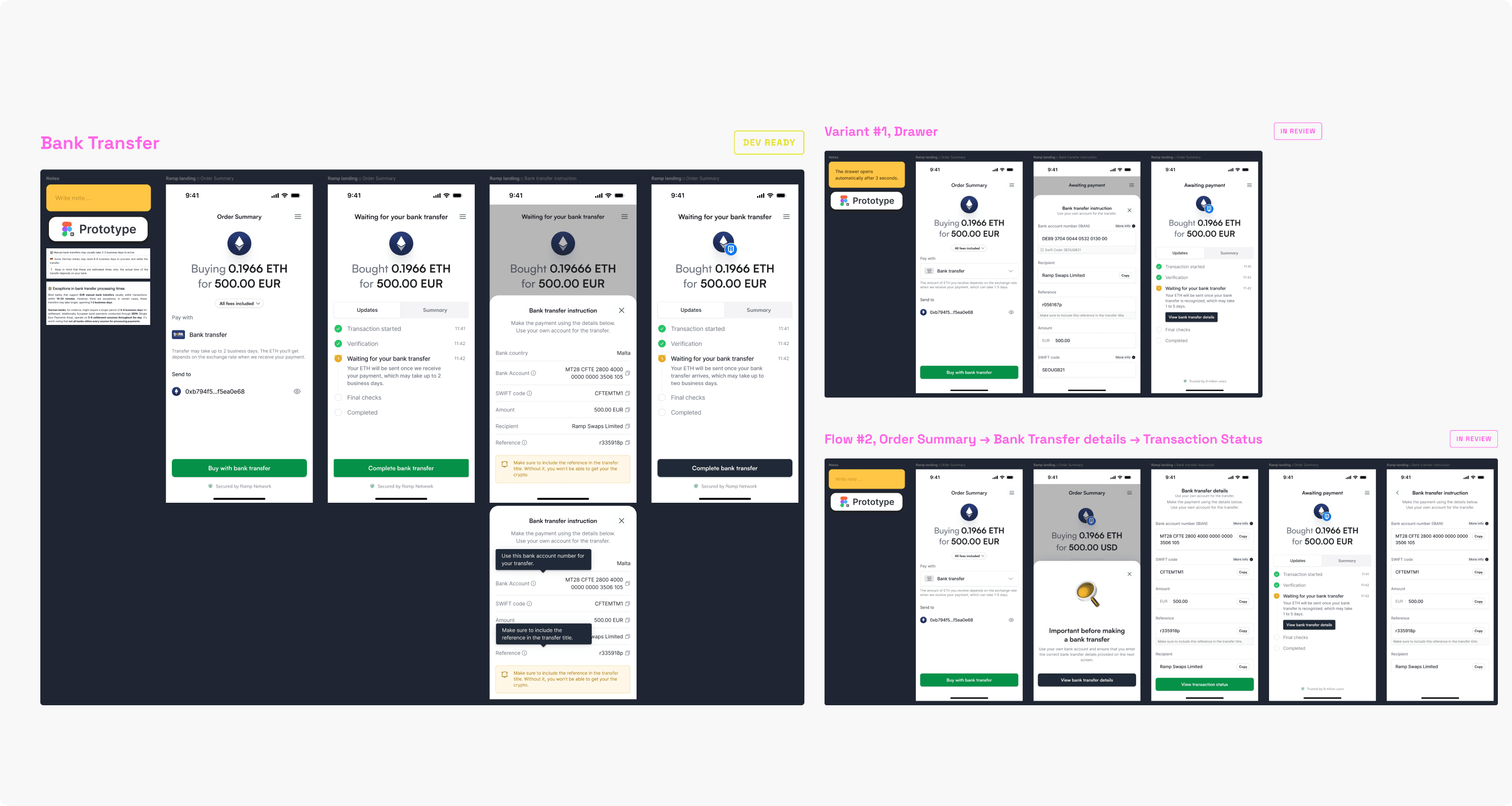
Refinement and implementation
My role is to prepare and document the design for all possible cases and ensure we have all the necessary components to implement the feature. If any component is missing from our Storybook, I add it to the design system in Figma and include its implementation in the scope of the initiative. We also define and describe all requirements in the Jira Epic, which serves as the basis for the development tasks created by the engineers.
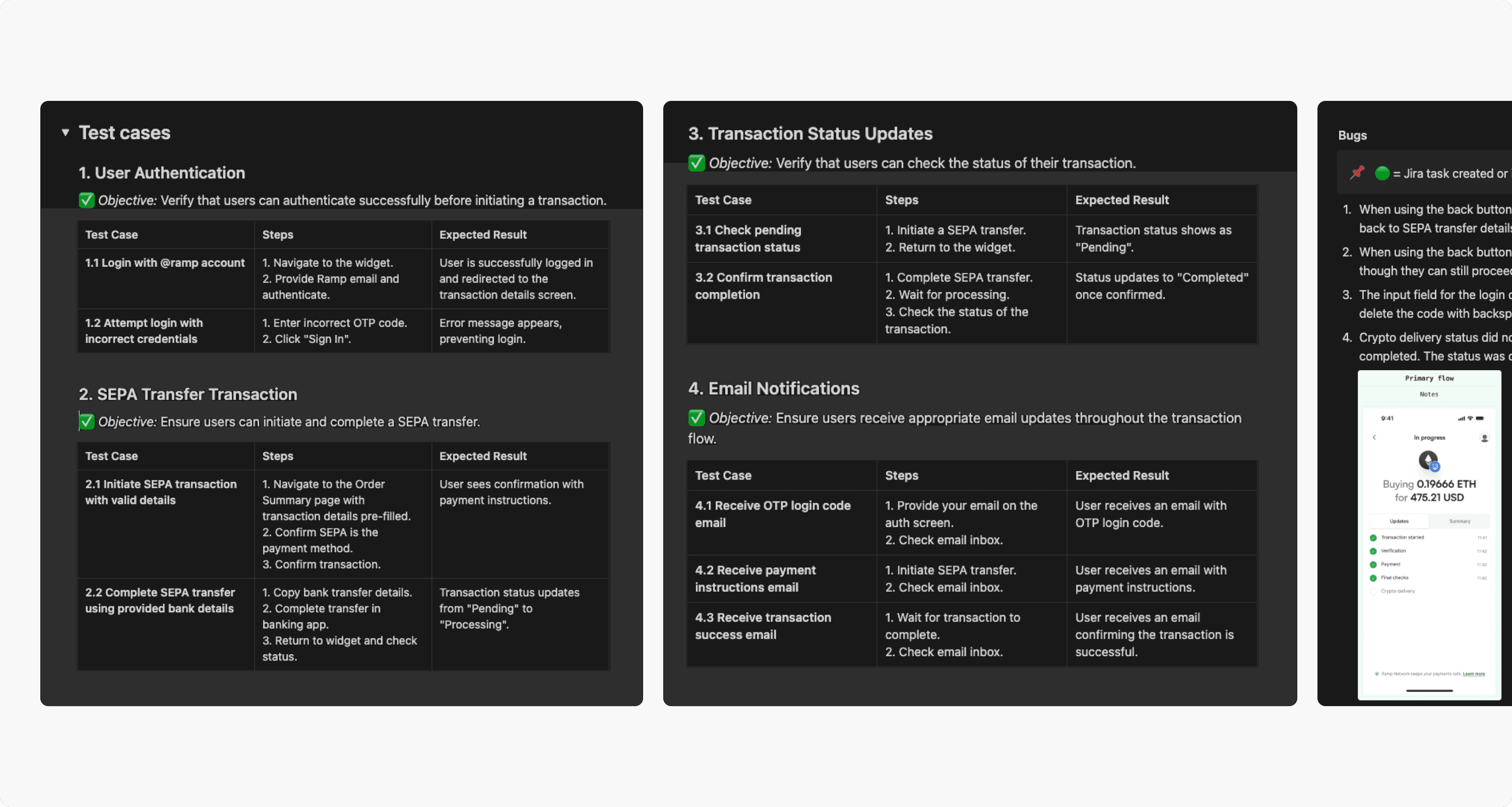
Internal usability tests
We first released the new process internally and ran a few internal usability tests to check if everything was clear. During these tests, we identified a few minor issues, which we addressed right away before the full release to all users.
Outcome
The result of our work is a service used by thousands of people around the world every day. We process millions of dollars monthly through our platform, enabling smooth crypto transactions. Our integrations power some of the biggest names in the crypto space, including MetaMask, Trust Wallet, and Worldcoin.